How it's built
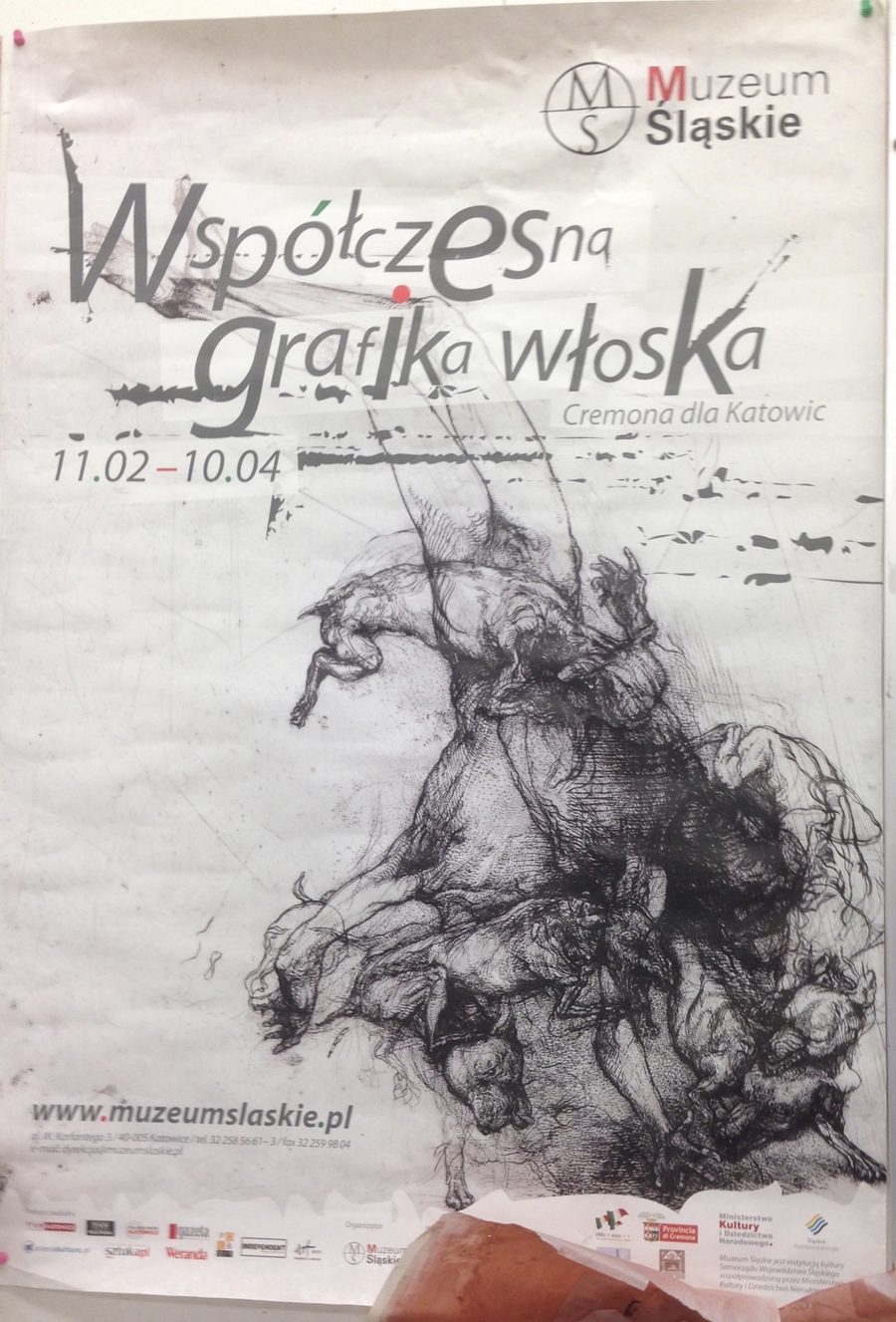
The whole image is one gesture: a vertical, roughly pyramidal column of bodies that leans slightly off its axis, which is what keeps it from reading as a static pile. It reads as motion, either a slow collapse under gravity or an updraft pulling everything upward, and the ambiguity between those two is a large part of why it holds the eye. The dense, near-black mass sits in a mostly empty sheet, and that emptiness does enormous work. There is almost no ground and no horizon, just a few faint horizontal drifts of tone, so the mass has no stage to stand on. It floats, monumental and isolated, and the eye has nothing to do but climb it.
The internal logic is accumulation rather than story. There is no protagonist and no single readable action. The forms are stacked and fused: at the top, long limbs stretch up and thin out into loose, searching line, so the figure literally dissolves into drawing at its apex; through the middle it thickens into a knot of flayed musculature, tendon and sinew and a coil that reads like viscera; at the base it gathers weight and resolves, just barely, into a heap of sighthound-like dogs with a couple of half-buried human figures folded among them. Top to bottom the image runs the arc the atlas responds to, bodies emerging from and dissolving into one another as a vertical sequence.
The approach to the body
This is an écorché sensibility, the body seen as flayed anatomy, muscle and connective tissue rather than skin and portrait. That points to real academic anatomical training, the Vesalius and Leonardo inheritance the Italian print tradition sits on top of. The animal and human hybridity, especially the dogs, brings in the other great source, the Renaissance and Baroque hunt, deluge, and last-judgment compositions where flesh is treated as one continuous churning material regardless of species. That is why the poster's true relatives sit as much in the deep-roots branch (Signorelli, Rubens, Géricault) as in the Italian postwar core.
How it was made
La caduta is a burin engraving (bulino), not an etching. Nothing is drawn into a ground and bitten with acid. Every line is cut straight into the copper by pushing a burin, a square steel shaft sharpened to a lozenge point, through the metal and lifting out a curl. The pressure of the hand sets the width: a line starts as a hair, swells as the tool goes deeper, and tapers out again as it rises. That swelling and tapering is what gives the contours their tension, and what reads on the poster as a nervous, searching line.
Tone is built entirely from those cuts. Directional hatching follows each muscle as it turns, a second and third layer crosses it, and in the darkest passages the lines are packed so tightly that the plate holds ink almost like a solid. What looked like soft drypoint burr in the poster is that density, flattened and softened by the poster's offset reproduction. With no acid involved there is no aquatint; the pale, mottled areas are open copper, light flicks of the burin, or the poster's own printing.
In studio terms, the composition probably began as separate studies of figures and dogs, assembled into that leaning column and transferred to the plate as a light guide. Engraving is slow and largely additive, so the plate grows by states: cut, proof, cut more. A line can't be loosened once it's in. It can only be scraped and burnished back out, so each one is a commitment. The density is the record of a long run of those sessions, a plate allowed to get dark and complicated rather than kept clean. That assembly-from-studies method and refusal to let any one body stay separate is the through-line straight into the Mosh Pit work.
An earlier version of this reading was written from the poster alone, before the artist was known, and guessed etching with drypoint and rebiting. The catalog's bulino and the full plate settled it.
One caveat
Some of the loose horizontal streaks and scattered flecks in the upper field may belong to the poster's typographic design rather than the plate itself, since the title is set in brushy, distressed lettering that bleeds into the image. With the catalog now in hand, the first thing to check is whether that atmospheric noise is cut into the copper or added by the designer.